Rebranding of St. Paul's School
A rebranding for a historic school in Barcelona
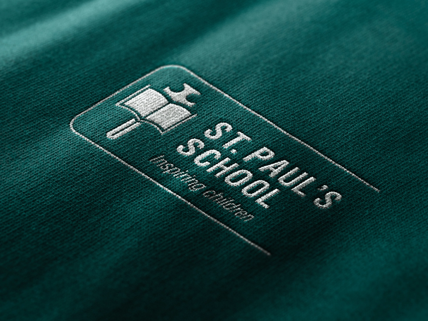
Rebranding is a thoughtful decision. Especially for a prestigious institution with a rich history in the collective memory. For St. Paul’s School, we have created a new visual and corporate identity that preserves its history and values, while also reflecting how it aims to evolve with the changing times.
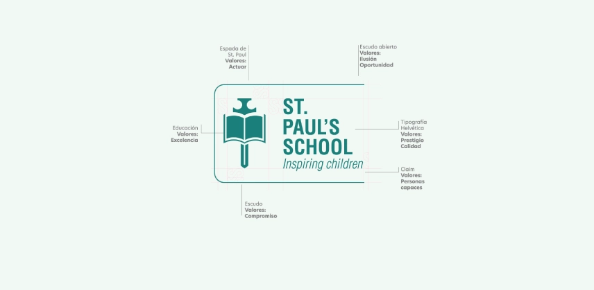
At Sibilare, we have constructed a new logo and guidelines: imagery, typography, graphics, and a complete color palette. We have modernized the brand by changing tactical elements such as the heraldic shield, now open to the world like this trilingual school. We replaced the original Latin slogan with an emotional one, "Inspiring Children".

The new color palette includes shades of green as predominant, the original color, but we combined them with orange, white, and blue. Together, we provide the brand with chromatic dynamism to differentiate the school's levels of studies.
Another key aspect we considered in this project is typography. We replaced Roboto with two new combined fonts: Helvetica and Calendas Plus. Clean, modern, and elegant letters that, together, bestow the historical prestige that St. Paul’s School deserves.